The little Prime Minister who never was

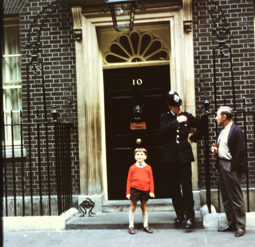
10 Downing Street, London, October 1969.

It seems extraordinary that such photo opportunities were presumably commonplace back then.  Mine had nothing to do with an invitation or acceptance of any kind of accolade, it was merely incidental.  Perhaps a child was ushered away before me and another ushered on afterwards.  How many of us have a similar photo in our family album?

I remember nothing of that half-term day trip to London.  The significance of the location would have been entirely lost on me as a five year old.  The background could almost be a ‘Mary Poppins’ set, there’s a kind of quaintness to the whole scene: my Uncle Earnest’s conversation with a very at ease bobby; my post box red jumper, school socks and oh so shiny shoes.

The date is prescient.  ‘The Troubles’ began a month later, no doubt precipitating a significant increase in security.

Ten years on

Fast forward almost a decade and I stood as part of a small crowd, fenced off  opposite the entrance to Number 10 where reporters stand today.  This was as close as we were allowed to get.  After what felt like a long wait but was probably only fifteen minutes, the then PM, James Callaghan, emerged to a round of applause and muted cheers.  Such polite deference (we were members of the public not Labour Party supporters) seems surprising from a 2020 perspective.  A brief wave and then Uncle Jim got into a waiting limousine and was driven swiftly away, probably to PMQs.  I would say this was autumn 1978.  The winter of Discontent lay just round the corner.

Me in time

When I rediscovered this transparency last autumn, I instantly felt a flush of pride, a kind of innocent, poignant pride.  I’m not at all given to feeling proud through association with public monuments or official occasions so the emotion caught me by surprise.

Perhaps it was the contrast between one little boy on the steps of the most prestigious address in the United Kingdom where that little boy just happened to be me.  And perhaps it was an instant realisation that such an incongruously domestic photo would be an impossibility today.

Lockdown 2

Stillness gives rise to an enhanced sense of place.  That’s place, not space.
There’s been so much said about space – safe spaces, ‘a space to do’, spaces rather than rooms, life lived in a white cube where we’re the curator.  Someone once told me, if you don’t know what to say in a gallery, say “It’s an amazing space”.  It’s a catch all phrase for admiring vacancy, absence and one’s own refusal to commit.  But you can’t grow roots in a space.

Clusters of spaces are called hubs.  I felt sad when I saw a sign of greeting outside a church which read ‘Welcome to our hub’.  Was there ever such a dead sounding word as hub?

The BBC’s ‘The Travel Show’ (‘showcasing the best of travel across the globe’) is the essence of space signifying little, a compacted stream of rhetorically efficient sensation seeking set against chromakeyed perma-blue sky.  The effect is akin to twenty-eight minutes being force fed overheated global tourism: a water slide, a dog sleigh ride, a champagne safari, a paintball brasserie.  It’s anywhere and everywhere yet it’s not here and neither is it there, a succession of air conned virtual experiences, places which have had their sense of place excised to form part of an entertainment feed, a colour rush of effects along fibre optic cables encircling the globe.  But when you pull apart the cables and look inside, what is there?

This lockdown here and now might be a pause in the linear time of our appointments but it doesn’t feel in the least like empty space.  It’s entering a slipstream that is covered over but always present.  May it come forth and show itself.  The place of ornaments, mantelpieces, curtain folds and dust.  The place of rusty door hinges, static grooves and mysterious carriage clock chimes.  The place of blossom flurries, tree trunk faces, worm casts.  And cheesy bugs curled up under stones.  Deeper, darker, longer, lower, older, smaller and younger.

[April 2020]

Lockdown 1

So strange to find myself in this most familiar of unfamiliars: home, yet not as I know it.

Everything is in its place but all around the landscape has changed.  Aliens watching from outer space unaware of the invisible virus, would hardly think human beings were a social species.

In the midst of this, there can be unexpected freedoms.

If I looked back to those 1970s’ photos, there would be a white space where I should be standing.  Like an action transfer or a Sugar Smacks freebie, some invisible hand has pressed round the perforations and stuck me onto this garden bench in the suspended here and now.  It’s not 2020 and it’s not 1971 either.  My legs are no longer swinging but my feet aren’t quite on the ground.

The garden has recovered a pastoralism unknown in decades – fat bumble bees, butterflies, birdsong.  Streets are as traffic free as fifty years ago. Something of the countryside has come to London.  Skies are big, the air voluminous, sounds reach my ears from streets away.  Through an open window, Tijuana Taxi drifts and blares, Testcard F playing to an empty lounge.

Or it’s 1974, I’m standing coltishly in Lee Wood’s garden and through the patio windows is a big box colour tv showing the blue-on-yellow BBC2 clock counting down to 4.30pm: ‘Service Information Follows Shortly’. The yellow is almost fluorescent, so brilliant it burns into the screen.  The picture is transmission test pristine, painfully so.  I can’t hear Syd Dale’s slinky Walk and Talk but I have to see every movement of the shaky second clock hand even although I’m supposed to be in goal.

Why was the private observation of these rituals so reassuring?

[March 2020]

Just wanted to say…

We begin this second selection of retro greetings cards with an atomic baby:

Happy 1st Birthday 1965

There’s a propogandist feel here.  Those eyes are looking forward to a new political dawn, the future light upon the face the glow of a protective atomic bomb.

I’m reminded of my mother telling me that two friends decided not to have children because, in the era of the Cuban missile crisis, the prospects for world peace looked so bleak.


Here is a playful take upon the paternal role in bringing up baby, again from 1965:

Giving Birth 1964

The handy father seems to be somehow supporting the pram.  This was back when prams still resembled spindly, nannyish devices from the Edwardian era (a year after Mary Poppins) not the armoured personnel carriers of today.


Staying with 1965:

Now You are 1 1965

That perenniel favourite, the cute kitten seen here with some kitsch acoutrements and hint of a Spanish holiday souvenir.


Now we are four and it’s 1968:

4 Today, 1968

Local newsagents were packed with cards like this.  The fezed monkey seems especially redolent of the time.


This has a decidely continental air:

Just for You, 1972

Slightly Bohemian, faux naive yet somehow also sophisticated.

Looking in shops today, I notice the very limited palette of most cards; often just one colour is used to offset monochrome and its typically red, pink, mauve in descending order.

But here vibrant, gypsy hues and an overall patterned design evoke European folk art.


This might be a scene from a Sunsilk shampoo advert.

Mother's Day 1974

The orange, nostalgic glow definitely pins this picture to the early-mid 70s.  1974 to be precise.


How many flowers can you fit into a dessert bowl?

Happy birthday card

Faking spontaneity, this sweet concoction would have been very carefully assembled indeed, probably with a little help from adhesive.  Its 1972 miniaturist precision is a million miles away from the boutique, long stemmed, au naturelle look of 2018.


We end with this wholesome scene from 1969:

Birthday child's 1966

A Little Something Especially for You


Moving House 
Growing up with Lego
Cuisenaire rods
Playplax

A Little Something Especially For You

Among the many family belongings I am still sorting through are stacks of greetings cards from the early 1950s to the early noughties.  

I thought I’d share some of those from the 60s/70s in random order across two posts. 


Is this charming or merely kitsch?

Happy Birthday 1969

It straightaway reminds me of the highly sentimental portraits of children lining the walls of department stores in the 70s (Woolworths, Boots, Timothy Whites).

Those shop waifs and strays invariably possessed doe eyes crying tears of dubious size down dimpled cheeks.  But this cheerful twosome have something of Bill and Penelope about them.


The Woolworths associations apply even more strongly to this portrait of cute, moral uprightness from the mid-late 60s probably aimed at doting grandparents:

Best wishes card

The prayerful pose would probably never find its way onto cards in our far more secular age, at least not outside of cathedral bookshops.  This isn’t how we want children to be any more.


I’m surprised that this Wedding Anniversary card dates from as late as 1966:

Birthday 1966

It could easily be from at least a decade earlier.  I imagine the vase carefully positioned in a palatial hallway by a butler’s begloved hands.

My collection is stuffed with variations on these rather stiff bouquets in as assortment of urns and classical vases.  They strike me as emblems of prestige though not of material aspiration, representing a kind of official good taste.  But they are also dull and respectable, joyless even.

In an age of care bears and other fluff, it’s the adult seriousness of this card which dates it most.


This has 1960s stamped all over it:

Anniversary card 1960s

The chequered brown, yellow and green background adds a modernist touch though the card belongs squarely next to a gilt carriage clock on a tiled mantelpiece.  When I look at this, I hear Frank Chacksfield, Royal Daffodil or perhaps Jim Reeves. 


A card which inspired a dozen These You Have Loved  LP covers.  Or was it the other way round?

To My Darling Wife, 1960s

To be given accompanying a large box of assorted milk chocolates.  The surprisingly underplayed message is rather endearing and all the more effective for that.


An Englishman’s home is his castle.

It’s 1969 and here we have a reassuring image of sturdy masculinity in the making:

5 Today, 1969

Background props are crucial; the bookcase implies inculcating a love of learning but the fireplace spreads parental warmth.

More choice selections in two weeks time.


Moving House 
Growing up with Lego
Cuisenaire rods
Playplax

Nestles’ animal bar


These friendly animals used to adorn the paper wrappings of Nestles’ Animal bars in the early 70s.  I have a feeling there was also a dog and a monkey maybe others.

I obviously liked them enough to cut out and keep.

The actual chocolate was fairly slender.

Cuisenaire rods

I vividly remember these ‘mathematics learning aids for students’ at primary school.  This would have been at the very start of the 70s when Cuisenaire rods were at the height of their popularity.

Until quite recently I’d assumed they were called ‘quizinaire’ having never seen the word written down and only rarely spoken.  They were always simply ‘the coloured rods’ which lived in the bright red plastic drawers at the front of the classroom.

The ten rods measured 1cm to 10cm with each increment represented by a different colour:

White 1cm
Red 2 cm
Light green 3cm
Pink 4cm
Yellow 5cm
Dark green 6cm
Black 7cm
Brown 8cm
Blue 9cm
Orange 10cm

The rods were the invention of Belgian primary school teacher Georges Cuisenaire in the early 50s.  Cuisenaire found that pupils who had difficulty with maths taught by traditional methods learned quickly when they manipulated the rods.  Child centred learning emphasised learning by play and Cuisenaire rods were a central part of the new ethos.

Magpie maths

In truth, my magpie instinct was more drawn to the colour element than the gradations in size.  I linked each numerical height with its colour so strongly that yellow was 5 and orange was 10.  The conflation held its own secret fascination.

I deduced that what the shorter rods lacked in height they made up for in brightness of hue as if each rod were granted an equality in power, balancing height with intensity of colour.  But why was red two and pink four and not the other way round?  Could there be a hidden significance to the order?

I might like to think all of this was some kind of synaesthesia but it was more likely an early manifestation of OCD or an autistic tendency.  Colours and car registration letters, numbers on front doors, the colours of clothes worn by particular people on particular days of the week quickly followed.

Unfortunately my appreciation of the rods failed to translate into lasting mathematical ability.  I obtained an ‘unclassified’ in my O level, the lowest possible grade (not proud of it in a “I’m hopeless at maths!” kind of way, just saying).

Tables or rods?

Child centred learning was central at my primary school.
Certainly in our earlier years, the emphasis was more on discovery not instruction, peer group learning rather than whole class teaching.

I even remember one teacher, straight out of training college, asking her class – did we want to do sums or painting?  Painting always won out so maths was neglected until at the age of ten I had a crash course in learning my times tables.  The class chanted them and my mother made me say them out loud or would suddenly demand over morning’s Golden Nuggets “What are twelve fours?”

But perhaps it was too little too late.

Seeing and doing

Still available but far less popular today, Cuisenaire rods now come in plastic which seems unimaginable as the woody feel and smell of them was very much a part of their appeal.  Rod No 4, the pink one, is now, for some reason, purple.

The most enjoyable thing to do with the set was – and still is – to build a pyramid.

Starting with the orange 10s, use four rods of each colour to form an overlapping square, working your way up through the blues, browns and blacks until you end up with a tight square of four white 1s on top.

Like this:

Cuisenaire company


PlayPlax
Growing up with Lego
Moving house

PlayPlax

I recently rediscovered my PlayPlax set, looking as bright and modern as it did nearly 50 years ago, minus only two squares of the original forty-eight.

PlayPlax (rather pedantically, I thought it should be PlayPacks as a child) was invented by Patrick Rylands in 1966 whilst studying at the Royal College of Art.

Ryland’s ‘spatial construction game’ consists of 48 brightly coloured plastic squares in red, blue, green, yellow and transparent.  An incision on each side allows them to be fixed together to form myriad, interlocking abstract shapes or architectural structures.  The Montreal Convention Centre is a real PlayPlax building.

Rylands became chief designer at Ambi Toys and PlayPlax a staple of children’s play during the late 60s through to the 80s with over a million packs sold.

Plastic fantastic

I used to spend many happy hours with PlayPlax, sometimes simply revelling in the bright colours.

The structures I made were part abstract imaginary, part versions of real-life buildings rendered bright, open, transparent and looking even more fantastic if the sun cast stained plastic reflections over the bedroom carpet.

I thought of my buildings as kinds of churches.  They bore no resemblance to a traditional spire and steeple church yet felt inspirational, hallowed in a very modern kind of way.  They would probably be urban art galleries now.

Six years ago, the original PlayPlax was reissued, no doubt with baby boomers in mind, using the same dyes and even manufactured in the same factory as back in the 60s.

I am sure I have seen a circular/cylindrical version in the intervening years but it’s the squares which have stood the test of time.

PlayPlax company
PlayPlax on Retrowow
Guardian interview with Patrick Rylands


Cuisenaire rods
Growing up with Lego
Moving house

Mythical Kings and Iguanas

The other day I turned on the kitchen radio and after a slight pause heard the opening notes of Mythical Kings and Iguanas, the title track to Dory Previn’s 1971 album.  It was as if I had just pressed play on my CD player:

I have flown to star-stained heights
On bend and battered wings
In search of mythical kings
Mythical kings

Sure that everything of worth
Is in the sky and not the earth
And I never learned to make my way
Down, down, down where the iguanas play

I’ve not heard Mythical Kings and Iguanas – the song nor the album – in perhaps twenty-five years though scraps have played in my head from time to time and I still have the vinyl LP.

I first heard it around 1987 or 1988 in my early 20s.  Last week it was as if it was playing to me for the first time:

Singing scraps of angel song
High is right and low is wrong
And I never taught myself to give
Down, down, down where the iguanas live

Stopped in my tracks, I put down my plate and my tea-towel, pulled up a chair to listen and for the first time found I understood.

Without any effort on my part, the words arose from the speakers and made utter sense as if they simply couldn’t help themselves.  I realised that, like it or not, I have lived enough to know what the song means instinctively.


Embed from Getty Images
Dory Previn


Lying with iguanas

Mythical Kings and Iguanas is about embracing the often despised ‘lower’ aspects of being and not losing oneself in fruitless flights of wishful fancy towards unobtainable heights.  Fundamentally it’s about gaining self-acceptance, becoming embodied.

In my 20s maybe I simply liked the sounds the words made, the overall sense of philosophical musing which, in a way, is what she is railing against:

Curse the mind that mounts the clouds
In search of mythical kings
And only mystical things
Mystical things

Buried treasure

In 1987 or 1988, without realising it, I laid a trail between then and now.  Rediscovery in 2017 meant connecting with my younger self and gaining awareness of a kind of unknowing, a certain confusion perhaps, which I couldn’t perceive at the time.

I think there’s real value in this kind of experience which goes way beyond nostalgia.  The feeling of connecting across time, is vivid and poignant, the sense of unlocking meaning without even trying, so powerful.

Had I heard the song for the first time last week, I would have ‘got’ it, been a little moved by it.  But there wouldn’t have been the discovery of buried treasure and finding it richer than I could ever have imagined.  And of feeling a kindness towards the moment of acquiring it so many years ago and someone I once was.

Cry for the soul that will not face
The body as an equal place
And I never learned to touch for real
Or feel the things, iguanas feel
Down, down, down

Where they play

The seeds that you once planted

This epiphany is a little akin to experiences of religion as a child and which organised religion possibly exploits for its own effectiveness.

The words of The Lord’s Prayer or of a particular hymn are planted in young minds at a time when they can be barely understood.  A seed of meaning is sewn with the potential to bear fruit many years later, when an old idea is revisited and subsequently accepted, modified or rejected.

At that point there may be the strong sense of time, growth, a journey, change and impermanence an awareness of being caught in life’s unstoppable flow.  And of a kind of learning which is natural, uncontrived, inevitable.

Could it even be wisdom?

Teach me, teach me
Teach me, reach me.


Melamine blue

A blue melamine cup…

What is it about that particular shade of baby blue – deeper than powder, softer than steel – which is so consoling, so pacifying, so utterly redolent of childhood?   And when rendered in melamine, perhaps the ultimate soft edged yet unbreakable material, the association is intensified again.

Baby blue featured very little in our 1970s’ household and yet the blue of that cup more strongly evokes early childhood than contemporaneous staples such as ubiquitous brown carpets or a sofa’s pukey orange.

Baby blue

It feels like that particular shade might have been born in the nurseries of the immediate post-war era.  Blue slows the metabolism, calms the nerves…  Like invalid cookery and Boots The Chemist, it provided a hygienic, protective wrap for atomic babies, consolation in an uncertain age.

Embed from Getty Images


I half-remember a flashback scene in an early Absolutely Fabulous where cot-bound baby Edina is comforted by a gently cooing mummy June Whitfield.  We see the new antispectic white-tiled world from Edina’s viewpoint but I’m sure there is also baby blue, perhaps in mother’s dress or a nurse’s tunic, for more than anything, this is the colour of the NHS, the diluted authority of a navy police force rendered oh-so comforting.

“I dare you!”

That melamine cup conjures one particular incident:  it’s summer 1969 and next door’s neighbour – a towering giant of an eight year-old – persuaded this five year old, for a dare, to pass through a low, concrete pipe carrying a shallow stream under a main road at the back of our house.   He would meet me the other side.

I don’t recall much of the darkened journey or the trepidation which accompanied it.  I do recall being found out by my mother and sent to bed at 5pm without any tea.  I lay accompanied by my constant bedtime companion, a giant panda called Peter, and on the table beside the bed, a blue melamine cup of tap water.

The words “You could have been killed!” still stung my ears and chilled my spine but all I could actually hear was the loud tick-tock of a (melamine) alarm clock, the swish of an occasional car and the distant chatter of my friends playing on the road.

Light filtered through daytime curtains in the way which only summer light can – unnatural, disturbing, the light of deprivation.  Normally a succour to nightmares, the water in the cup had become prison ration austerity, the ultimate in neutrality and antiseptic punishment.

Yet somehow through this, the soft-hard blue melamine maintained its unbreakable comfort as if it had been chosen to prevent a prisoner from coming to harm.  It was like my mother’s presence in the room, still nurturing even though I had been disobedient.

So there I lay awake for countless wide-eyed hours, gazing into the blue, listening intently to the racing tick-tock of the alarm clock, until day became night and sleep finally descended.

Blue comfort

I learned my lesson and never went down the concrete pipe ever again.

That shade of infinitely mid-mid-blue continued to crop-up though less frequently as time went by.  I think particularly of an Adidas skinny-rib T-shirt in 1978.  Now, baby blue is largely confined to NHS logos and sanitary ware products or the textured panel of an Oral B toothbrush.

The memory of that particular afternoon, so confining and nerve-shattering at the time, now raises a smile.

My cup overfloweth.